Kidney Information Network

Project Overview
I had to create a mobile application for patients for a live client university project. This would be used to see blog posts, share recipes and information regarding kidney diseases and have the option to talk to a specialist through in-app messaging and calls. I started the project with discussing with the client what their goals were for the mobile app. Then I did some research, reviewing and evaluating similar apps to KIN to see how well they were doing and created a use case for a realistic app. After this, I designed the wireframes on Adobe XD.
Project Research
Mobile App Evaluation
To get a better idea of what other health apps were doing, I created an evaluation of three different apps. They would be rated out of 100 in each category: functionality, user interface, device compatibility, performance and support. These were chosen because they each hold importance when it comes to user experience and minimising frustrations.
Symple
Symple is a general awareness app which monitors your health. It has features such as allowing users to track up to 5 symptoms a day, integration with fitness trackers like sleep and heart rate tracker and easily share history of symptoms with the doctor.

Medscape
Medscape offers the latest news and insights from the medical world. It has some notable features such as offering a wide collection of medical articles for users to read, latest news articles from medical professionals and users can get consultation regarding several diseases and medicines through the app.

Health Pal Fitness
Health Pal Fitness is a general health app which offers features such as water and diet reminders, home workout plans, health fitness goals and many more.
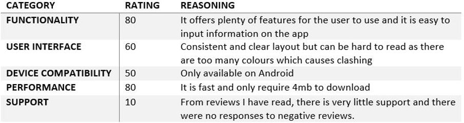
Doing this evaluation was insightful and reminded me I should always be consistent with design to minimise colour clashing and ensuring information is concise and easy to read.
Use Case
I created a use case diagram to demonstrate what happens when the user is interacting with the product.

Non-functional requirements demonstrate how the product should behave. Here are some non-functional requirements I implemented:
-
The colours used should relate to the company logo and ethos
-
Gesture design – drag and pinch
-
Vertical Navigation
-
UI design patterns – clear primary actions, required field markers
Wireframe
I created a wireframe using Adobe XD and made a live prototype using MIT app inventor. I made sure there was clear vertical navigation when exploring pages and ensured the colours suited the company logo and ethos. Due to this being my first ever design project, the majority of my time used was getting used to the UI and tools. I tried to make the pages as consistent as possible to improve the layout and overall design.
Final Design
Sign Up and Sign In Pages
.png)
Homepage - News Feed
-2.png)
Homepage - Navigation
-3.png)
View and Add a Recipe Pages
-1.png)
View Messages and Message Someone Page
-4.png)
Project Takeaways
What Worked?
-
The wireframe was functionable and had clear sectioning between pages.
-
The layout and colours were consistent.
What Didn't Work?
-
I created my own icons, which made the overall design look unprofessional.
What Did I learn?
-
How to use Adobe XD.
-
Importance of consistent design
-
Being more resourceful with my time


