Student User Hub
Project Overview
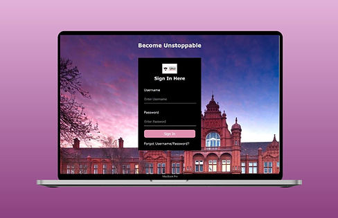
For a final university project, I had to create a website for a student user hub. This was to track students’ weekly schedules, latest news around campus, deadline due dates and module details and documents. I was requested to design the UI/UX, and to develop the website using HTML, CSS and JavaScript. For the UI, I created high fidelity wireframes using Adobe XD, and I used Visual Studio Code to fully code the website.
Research Findings
By surveying 37 participants, I found that 95% of people used computers and 68% of people used their mobile phone to access university resources. Research from the survey also verified that students prefer to have good navigation between pages, fast loading times and responsive design when accessing a website. Using this information along with secondary research I had previously done, I discovered the importance of responsive design and implemented a desktop and mobile design to my case study.

Wireframe
I created a mobile and desktop design of the website using Adobe XD. The pages included a Sign In page and the homepage. Keeping all the information and features on one page helped users to obtain information from a glance and to minimise the clicks needed to find information they were looking for. I used the 60-30-10 colour rule to pair suitable colours together and make the design consistent and easy on the eyes for the user.


Development & Prototype
I developed the website using Visual Studio Code. I took a large amount of time learning HTML and CSS as this was my first website I developed. I realised some of the features I included in my wireframes, such as the calendar, were quite difficult to implement. This changed my initial design and I had to find an alternative to find the solution. Instead of implementing a calendar, I used accordions to display information. While it does take away from the visual aspect, it was a quick solution I needed to fulfil the user requirements.
Focus Group Feedback
I set up a focus group of three participants to review the website. The responses were fairly positive. Suggested improvements included having a fixed navigation, and getting rid of extra white space. Due to time restraints of the project, I was unable to complete these improvements.
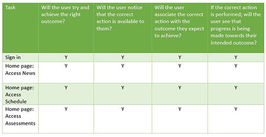
During the evaluation, I carried out a cognitive walkthrough to ensure each task and action could be completed on the website.
Comments from the Focus Group:
Positives:
-
Good navigation
-
Well thought out design and layout
-
Nice choice of colours
Improvements:
-
Fixed Navigation
-
Slideshow of images as an introduction
Cognitive Walkthrough
Project Takeaways
What Worked?
The survey was helpful in supporting the use of responsive design and seeing what features students wanted on the website.
What Didn't Work?
My coding skills were a disadvantage here because it decreased my ability to add certain features like the calendar.
What Did I learn?
Coding the website taught me that I must make sure design features can be implemented on a live website or it may be difficult to implement.


