Salford University Careers Website
Project Overview
Salford University Careers wanted a revamp for their website homepage to showcase their services such as CV checks and mock interview appointments, current events, weekly drop ins as well as informative secondary pages.
For the new website design, I examined other university websites to gauge different ideas and designs using a competitor analysis. I then identified the strengths and weaknesses within the current website, as well as creating user flows and carrying out user research. Using figma, I created a new design that would work within the limitations of the website to create more functionality and organisation for students.
As well as designing the website, I also worked on the CMS using ChatGPT to re-create content given on the secondary pages to ensure it was more concise and digestible for the reader. I believe the project was a success as my contributions aligned to the user needs, and staff members could find the resources they needed to help students with accessing the website.
Project Findings
I gained 100 survey responses from students through email and face to face interactions, regarding the awareness of the website, their first impressions, usability and design of the website. I found that students had difficulty finding relevant content concerning job opportunities and navigation so I ensured these features would be made apparent in my designs.
STATISTICS FROM SURVEY:
-
52% of participants had a positive first impression of the website
-
Participants gave an average rating of 6.37 for the website design
-
Participants rated navigation an average of 6.25
Wireframe
I created a wireframe and prototype for an ideal website using Figma, which would feature clear buttons to services, advertise job openings and graduate schemes and a clear table for weekly drop ins and events. Due to limitations, I had to alter the design to cater to the company’s website content management system. By using the pre-existing element blocks and styles, I created this design that would improve the overall design and functionality of the website.
Final Design
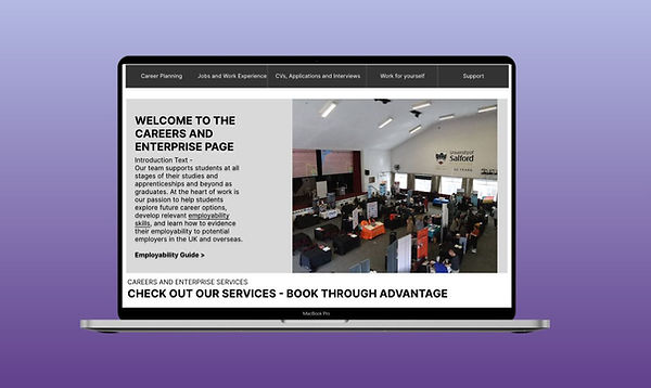
Homepage - Introductory Text & Service Buttons

The first section of the page has an introductory page with a clear title at the top as the previous design did not have a clear indicator of which page they were on. Below this are the service buttons. Placing the buttons at the top allows students to access what they want quickly with ease without spending more information finding what they need.
Homepage - Spotlighted Information Pages

The second section has a spotlight page for informative pages. Previously there were other pages that were advertised, however, using the web traffic statistics, I found that these pages had the lowest viewings. I came to the conclusion that just because they had a spotlight on the page did not mean students were interested in what was shown. Using the web traffic statistics and suggestions from my survey, I replaced the old pages with the most popular pages.
Homepage - Drop In Section
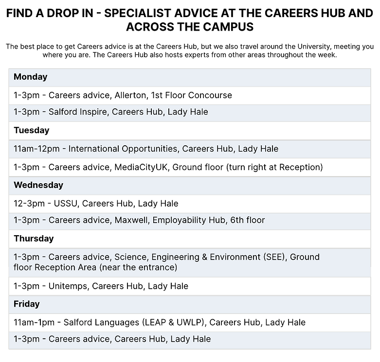
The third section is a timetable for the weekly drop ins. Previously this information was written out in paragraphs, with limited styling. This has now been put in a table, making it clearer to read and visually appealing.
Homepage - Events Section

The last section has the latest events and contact information. In the previous design, the events format was displayed horizontally instead of the current grid like format. This made users scroll more than necessarily. Using this grid format allows students to have a quick glance to find what event they would like to go to without having to scroll down to see all the results.
Website Content
I collaborated with the website development team to discuss any improvements that could be made with the website. I realised some of the information content was long-winded and parts of the content were written by different authors, with different writing styles. I used ChatGPT to make the content more concise and digestible for the user to read. This would cut down reading time by a few seconds, and allow students to obtain the information they need with ease.

Project Takeaways
What Worked?
Good quantitative research helped me to understand the user and re-evaluate what changes needed to be done.
What could be improved?
Creating more qualitative data to understand what design students would want on the website
What Did I learn?
I learnt to collaborate with other teams, and communicate effectively. I learnt how to present and visualise data.


